
Aimee app
Sector
Healthcare (Medtech)
Overview
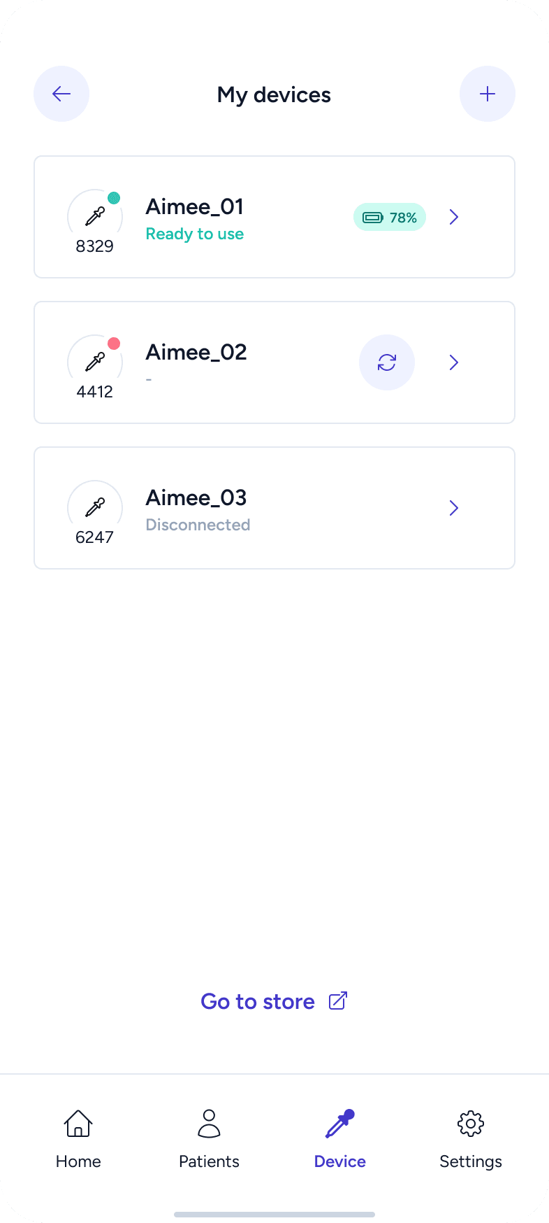
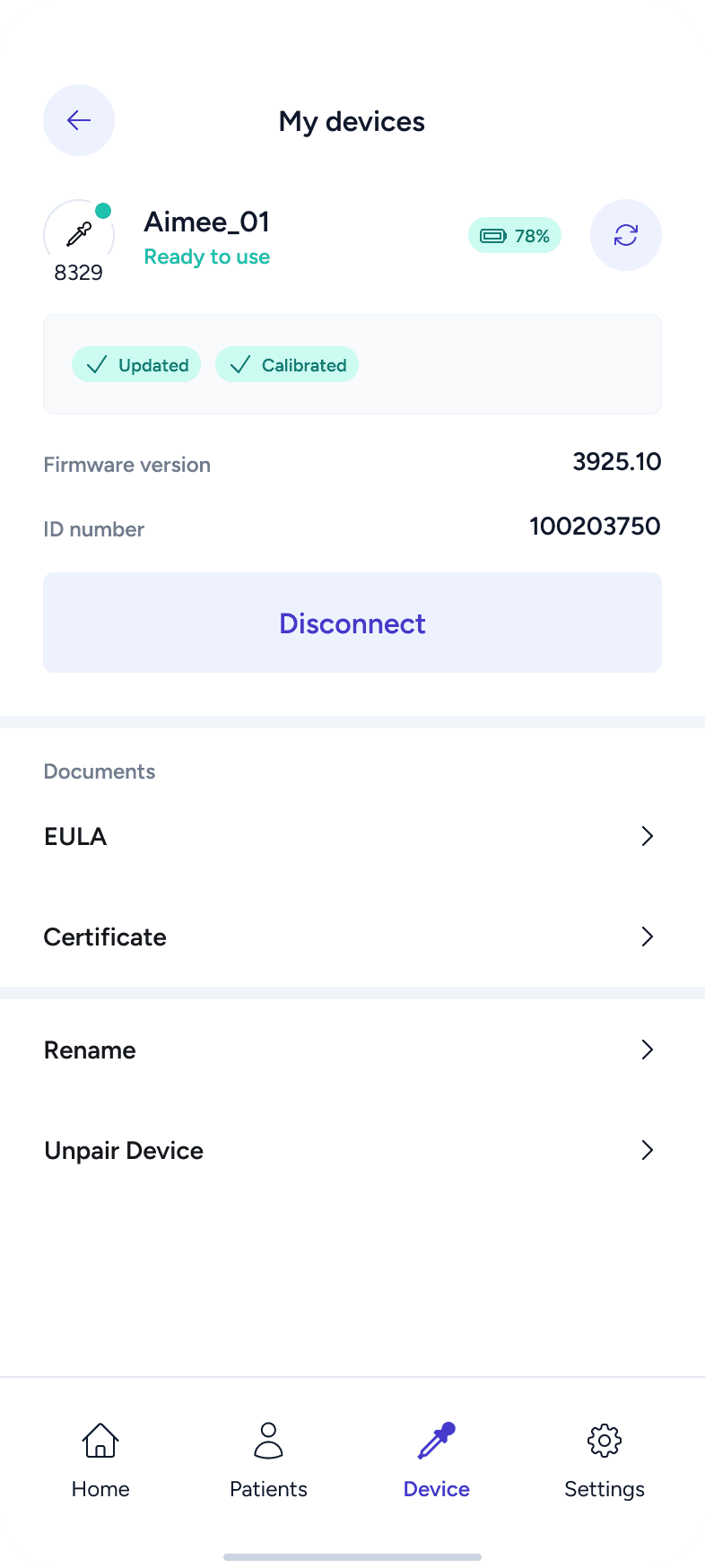
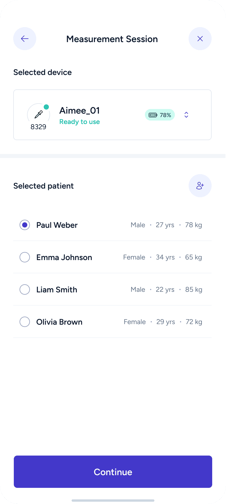
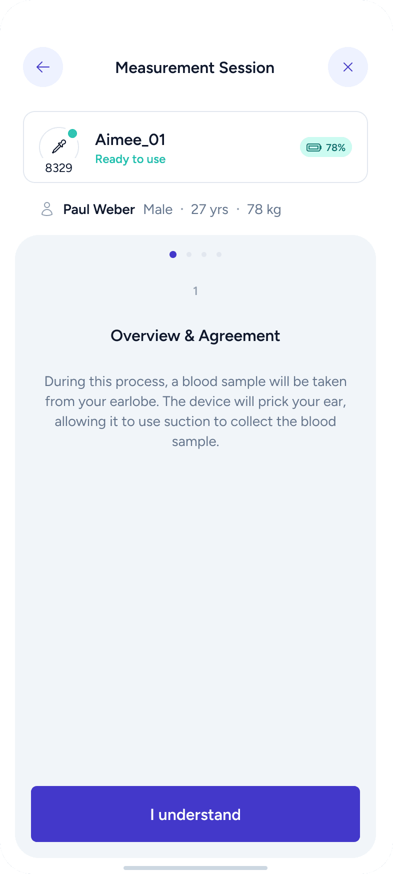
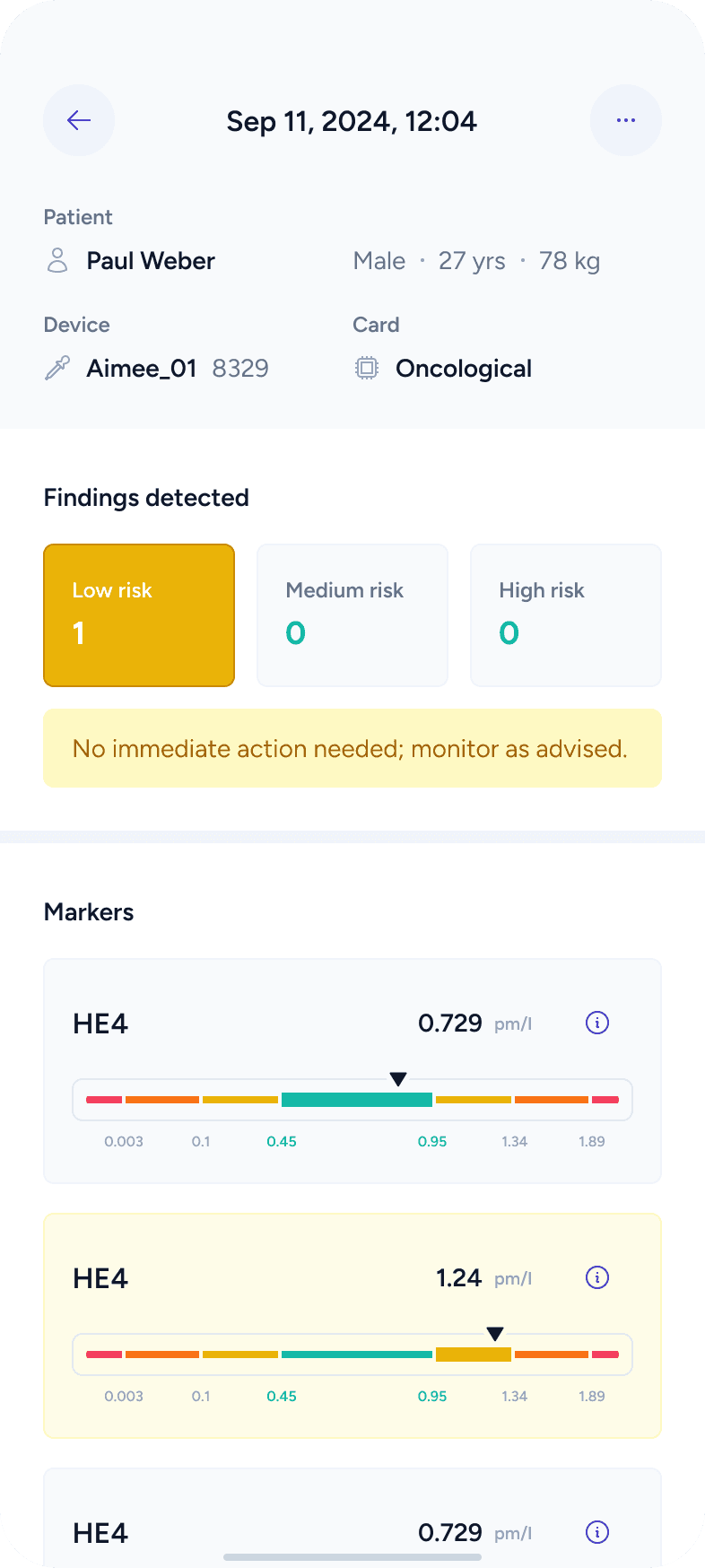
Aimee is a medical device designed to analyze blood samples and provide insights about a patient’s health. The device works together with a mobile application, which guides users through the measurement process, displays results, and helps manage patient data in a clear and understandable way.
My role
Product Designer
My role in this project was to design a mobile application that manages the Aimee medical device and its measurements. This included shaping the user experience, defining workflows, structuring information, and designing a clear and trustworthy interface for medical data.

Workflow
I followed the Double Diamond design process, moving through four main phases:
Research > Insights > Ideation > Design
This approach helped me first understand the problem space, then define user needs, explore solutions, and finally deliver a polished UI.

Research
Product Study
I started by understanding the AIMEE device itself — how it works, what kind of data it produces, and how users are expected to interact with it. This helped me to understand the product and prepare the questions for consultations.
Consultations with Client
To fully understand the product and expectations, I prepared a structured set of questions for the client. These focused on device operation, user types, data interpretation, and key priorities for the app. This step ensured that design decisions were based on real product requirements rather than assumptions.


Competitor Analysis
I analyzed existing apps in the medical and health-tracking space. I collected screenshots of similar products to study their onboarding, navigation, data visualization, and tone. This served as inspiration and helped guide later steps such as ideation and visual UI direction.
Insights
User Personas
Based on the research, I defined user personas representing different types of users interacting with the system (for example, medical staff and patients). These personas helped me evaluate decisions from multiple perspectives and keep user needs central throughout the process.


Analysis of Key Operations & Requirements
I identified all possible user operations and scenarios based on insights gathered during the research phase. This included core tasks, edge cases, and system requirements. The goal was to fully understand what the app needs to support before moving into layout and design.


Information Architecture
All operations and requirements were gradually transformed into an information architecture using a FigJam board. At this stage, I focused on:
defining what information needs to be shown at each step
mapping different user scenarios
identifying possible features and actions
This process helped shape the structure of the app and served as a strong foundation for wireframes and layouts.

Sitemap
As part of the information architecture work, I created a sitemap that clearly shows the structure of the app and relationships between screens. This helped validate navigation logic early and ensured a smooth user flow.

Ideation
Ideation & Iteration / Wireframes
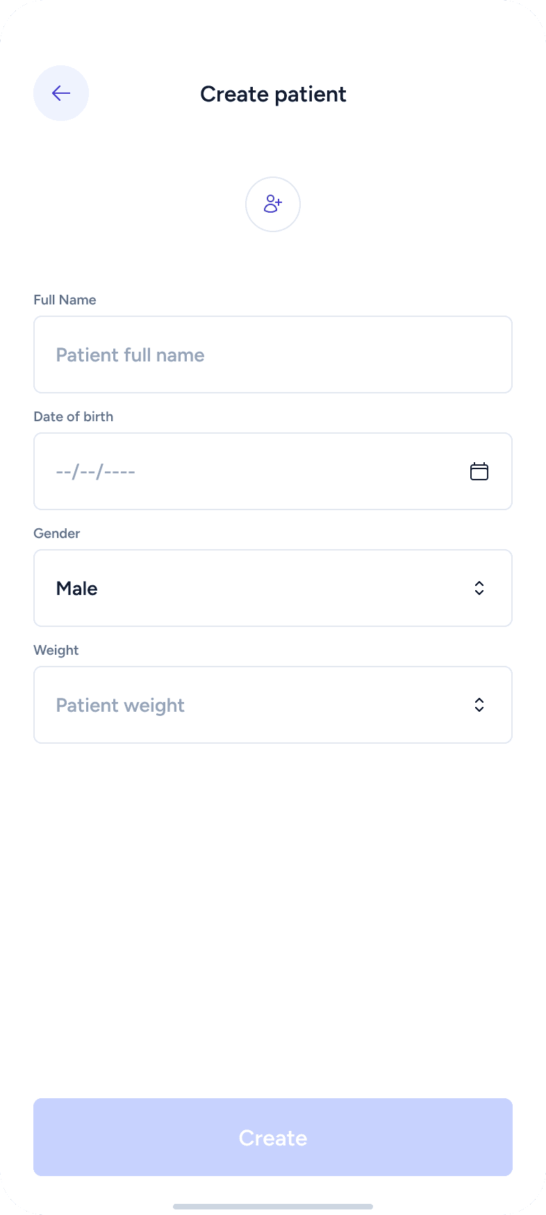
In this phase, I translated ideas into low-fidelity wireframes. Layouts were created with real content, components, and icons, organized into logical structures while respecting UX principles. Different user scenarios were tested and reviewed through the lens of each persona.
Key principles applied:
clear primary vs. secondary actions (CTA)
logical information hierarchy
familiar patterns (Jakob’s Law)
reduced complexity to support faster decisions (Hick’s Law)
simple and clear navigation


Design
Visual Definition / UI Style
The visual style was designed to feel clean, professional, and trustworthy, which is essential for medical products. The interface avoids unnecessary decoration and focuses on clarity, calmness, and reliability.
Design System
I created a design system in Figma, including color variables and text styles. These were carefully planned to ensure consistency, scalability, and easy maintenance.
The system was built with developer handoff in mind, following Tailwind-friendly constraints and modern accessibility standards.
Key goals:
developer-friendly structure
visual consistency
scalability
easy updates and adjustments
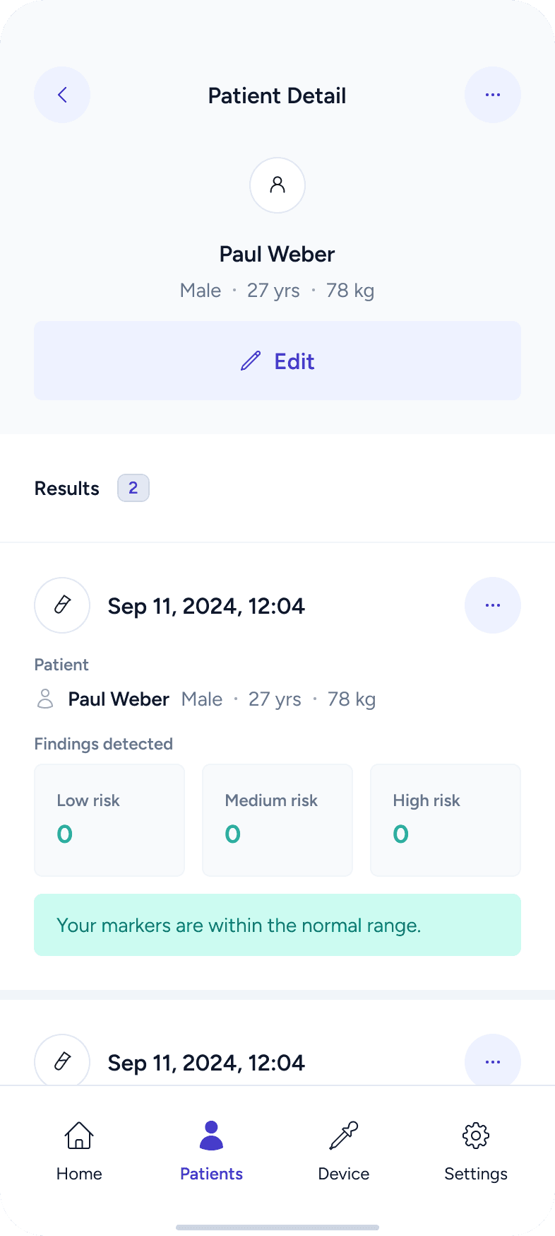
Components
Reusable components were created using Figma variants and variables. This allowed efficient iteration, consistency across screens, and easier testing of different states and scenarios.

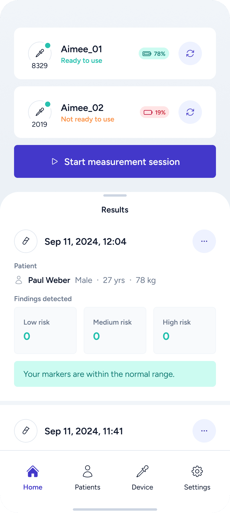
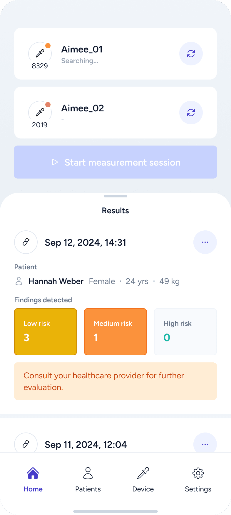
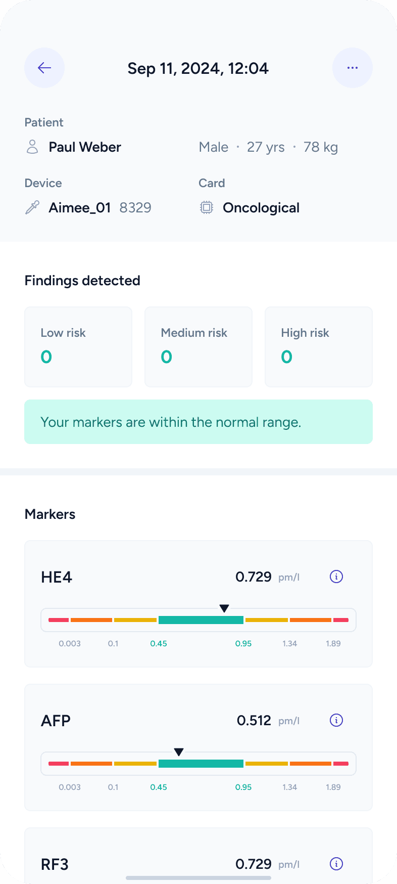
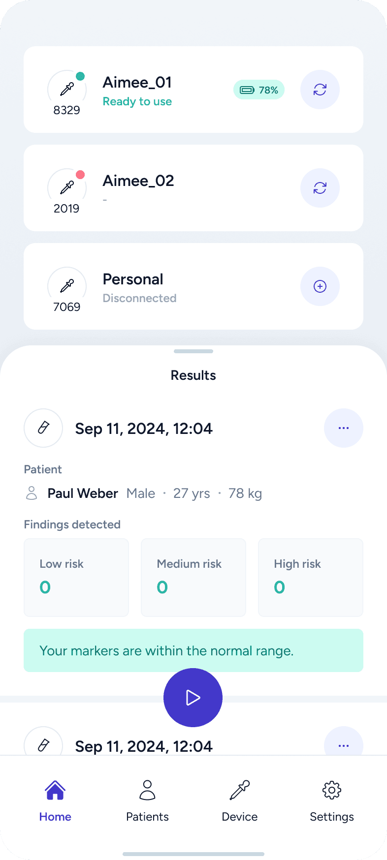
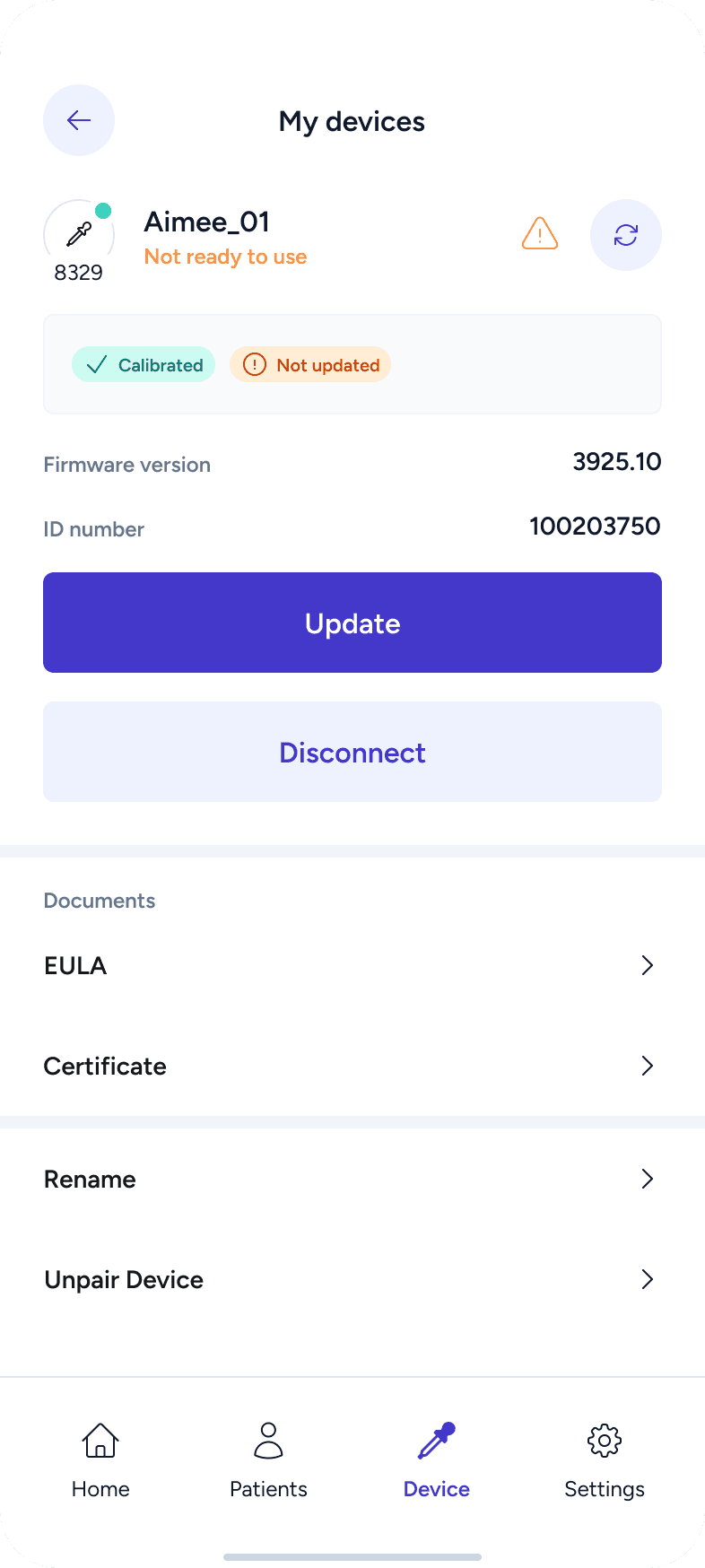
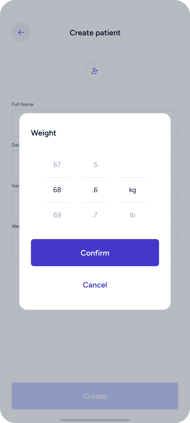
High-Fidelity Design
This phase brought everything together into polished, high-fidelity screens. Using Auto Layout, variants, and styles, I designed complete user flows and validated them across different scenarios.
Special attention was given to:
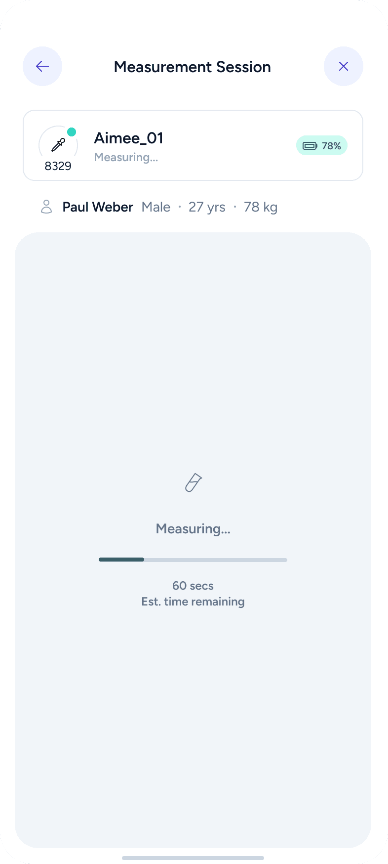
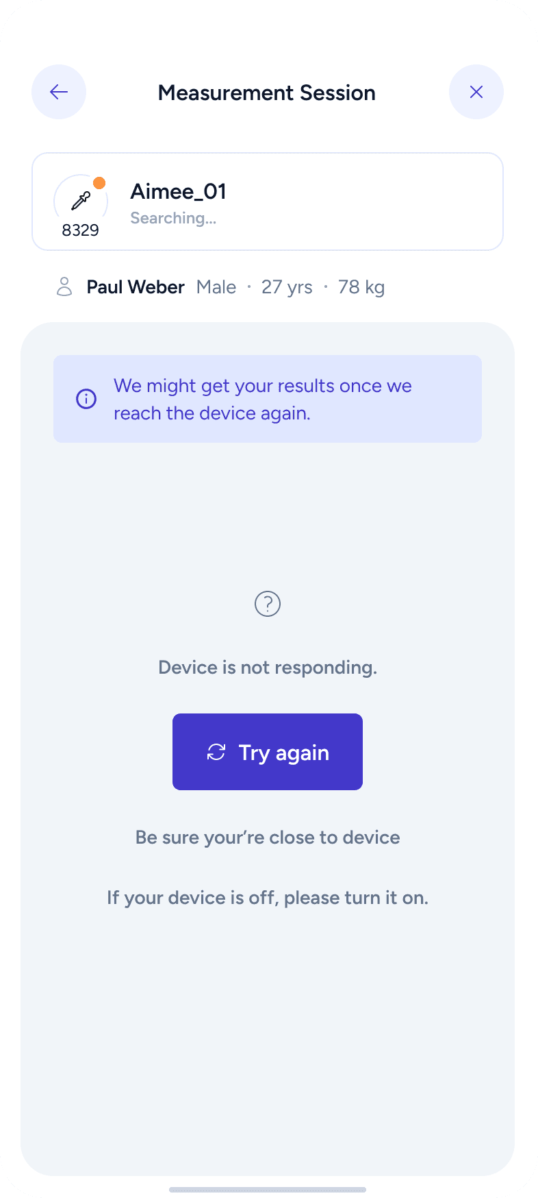
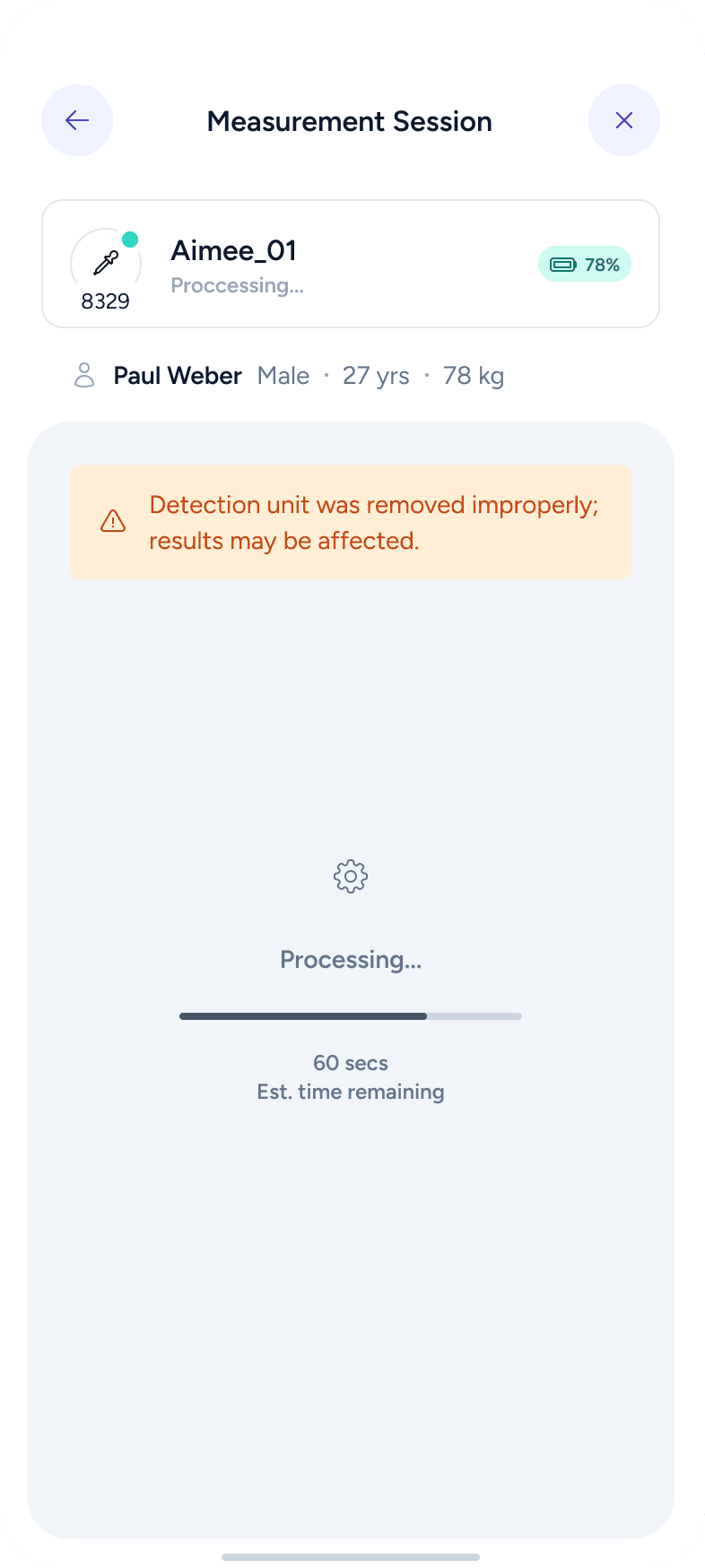
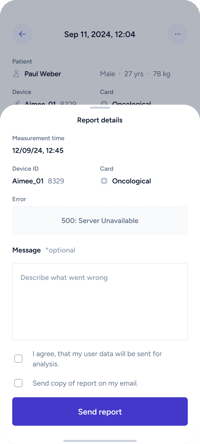
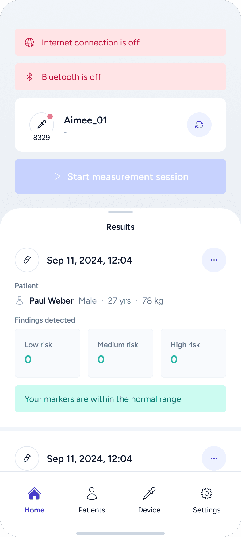
empty states
error and fail scenarios
dialogs and warnings
secondary and edge cases
Key principles:
responsiveness and adaptability
4-pixel grid system
sufficient color contrast
clear content hierarchy
easy readability

Final words
What I valued most in this project was the level of trust from the client and the freedom to shape the whole experience. Being able to control the full workflow helped me keep the design consistent and purposeful.
I also genuinely enjoyed the challenge of designing for healthcare. Knowing that the product is connected to someone’s health made me more thoughtful and careful — and reminded me why empathy is such a key part of good design.

